Why Your Website Isn't Converting (Even With Good Traffic)
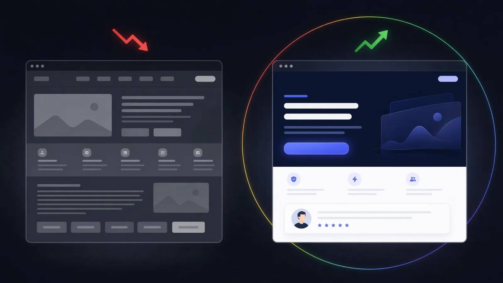
A thousand visitors a month and three enquiries. If that ratio sounds familiar, your problem is not traffic. Most business websites quietly lose the vast majority of the people who land on them, and the owner never finds out why: visitors do not complain, they just leave.
The why is rarely mysterious. Audit enough business sites and the same five problems appear again and again. Here they are, along with a way to check your own site for each one in about ten minutes.
The five silent conversion killers
1. The site is slow. Picture your visitor on mobile data: they tap your link, wait, watch a blank screen, and go back to WhatsApp before your headline ever loads. Slow sites do not get complaints; they get silence, because the person who would have complained is already gone. The risk is highest exactly where many of your customers are: on a phone, on a weaker connection.
2. There is no obvious next step. A visitor who is interested should never have to think about what to do next. If your homepage has six buttons of equal weight, it effectively has none. One primary action per page. Everything else supports it.
3. There are no trust signals. Real names, real photos, real numbers, visible contact details, reviews from actual clients. Their absence is louder than their presence. A visitor who cannot verify you exists will not send money to you.
4. The copy is about you, not them. "We are a passionate team dedicated to excellence" tells the reader nothing. "We help clinics fill their appointment calendar" tells them everything. If your headline could sit on a competitor's site without anyone noticing, it is not doing its job.
5. It was designed on a desktop, for a desktop. Most of your visitors are on a phone. If the mobile version is a shrunken afterthought with tiny tap targets and a buried contact button, you are losing the majority of your audience to save effort on a minority.
Audit your own site in 10 minutes
You do not need an agency to find out where you stand. Run these five checks right now:
- Speed test (2 min): run your homepage through PageSpeed Insights on mobile. Under 70 is a real problem, not a detail.
- The five-second test (1 min): show your homepage to someone who has never seen it for five seconds. Ask them what the business does and what they were supposed to click. If they hesitate, your visitors hesitate.
- CTA count (2 min): count the actions above the fold on mobile. More than one primary button means no primary button.
- Trust scan (2 min): can a stranger find your phone number, a real client review, and who is behind the business in under two clicks? Time it.
- The swap test (3 min): read your headline and replace your business name with your closest competitor's. If the sentence still works, the copy is generic.
Two or more failed checks usually means the site is costing you clients every week. If this sounds like where you are stuck, a focused redesign typically fixes it faster and cheaper than pushing more ad spend into a leaking page. That is exactly what our website services are built for.
What "conversion-first" design actually means
Conversion-first is not a style. It is a discipline: every element on the page has to justify its existence by moving a visitor toward one action.
The simplest way to picture it is a house. A good website guides a visitor like a well-designed home: a clear entrance, rooms with a purpose, and a door to the next step. Most leaking sites fail as houses fail: people walk in, look around, and leave because nothing tells them where to go.
In practice it looks like this:
- One job per page. The homepage builds enough trust to earn a click. The services page turns interest into a booked call. Neither tries to do everything.
- A visible, repeated primary action. "Book a call" appears where the decision happens: after the proof, after the pricing context, at the end. Not once, hidden in a menu.
- Proof next to promises. A claim ("we triple lead volume") sits beside its evidence (a named testimonial, a real project) instead of living on separate pages.
- Forms that respect the visitor. Three fields convert. Eleven fields filter out everyone except the desperate.
- Speed as a feature. Compressed images, no bloated scripts, instant first paint. On slow connections this is the whole game.
The difference shows up in numbers, not aesthetics. The same traffic and the same offer, restructured around one clear action, gives the visitors who were always interested a clear path to follow. Measure it where it counts: enquiries, bookings, and completed forms per hundred visitors, before and after the change.
Traffic is an amplifier, not a fix
More visitors multiply what your site already does. If it converts, more traffic means more clients. If it leaks, more traffic just means losing money faster. Fix the container before paying to fill it.
Run the ten-minute audit above this week. If your site passes all five checks, invest in traffic with confidence. If it fails two or more, you now know exactly what is holding it back.
Quick checklist
Before you spend another euro or franc on traffic, confirm that:
- your homepage scores above 70 on PageSpeed Insights mobile
- a stranger can say what you do after five seconds on the page
- there is exactly one primary action above the fold on mobile
- your phone number or WhatsApp is reachable in under two clicks
- at least one real, named client review is visible
- your headline names the client's outcome, not your passion
- your contact form asks for five fields or fewer
- you know your current number of enquiries per hundred visitors
Want a second pair of eyes on this? Book a free 20-minute call. No pitch, just a clear look at what is stopping your visitors from becoming clients.
Too busy for a call right now? Send us your project through the contact form. It is already prefilled for this topic, so it takes two minutes. Or message us directly on WhatsApp. Either way, you get a concrete answer within 24 hours.